Monday, November 17, 2014

Summary of Findings: Visualization (4.5 out of 5 stars)

Note: This post represents the synthesis of the thoughts, procedures and experiences of others as represented in the 5 articles read in advance (see previous posts) and the discussion among the students and instructor during the Advanced Analytic Techniques class at Mercyhurst University in November 2014  regarding visualization specifically. This technique was evaluated based on its overall validity, simplicity, flexibility and its ability to effectively use unstructured data.

Description:
Visualization is an analytic modifier used to add an additional level of understanding and comprehension of complex data.  Data visualizations are normally associated with quantitative data, but qualitative issues are able to be represented as well.  There are plethora of free, simple to use visualization tools available for those without computer science backgrounds (i.e. Tableau, Google Fusion Tables, CartoDB, etc.).  For a more complete list of, and links to, data visualization tools, see the resources section at the bottom of the post.  

Visualizations are most effective when they obey general rules of graphic design, but personnel knowledgeable of graphic design are rare in the intelligence community.

Strengths:
1.Can provide a tangible two or three-dimensional object to physically show decision makers
2. Provide an effective way to present completed material
3.Can examine and display relationships that might be overlooked in a written form
4. Can bolster analyses
5. Can be outputted automatically through software programs
6.Provides a way to identify and link patterns
7. Can give decision makers an interactive way to visualize information

Weaknesses:
1. The use of visualizations is not a one-size fits all modifier
2. Creating visuals requires time from the analyst
3. Design software is not only expensive, but can be difficult to master and use effectively
4. Analysts creating visualizations are prone to using templates which make their visuals unimaginative and plain
5. There is no set of specific criteria that determines what is an effective visualization

Step by Step:
Note: This is reasonable description of the steps one would take in making an effective visualization.  
  1. At the onset of the project, identify likely sources of data and likely visualizations for the final product
  1. During the data collection process, continue to assess what type of data you are collecting and what will be the best way to present this data to your decision maker
  2. Identify the tools and resources you will need create the visuals
    1. If you lack the resources to acquire a certain tool needed to visualize the data in a certain way, alter your design method to find a way to display the same information in a different format
  3. Assess visuals throughout the entire project cycle to ensure that they are telling the same story that the written report tells

Exercise:
After a brief instruction period, participants visualized seven information units pertaining to their identity as intelligence professionals associated with Mercyhurst for 15 minutes, incorporating images from the internet, a foam presentation board, and traditional art utensils such as markers, colored pencils, and glitter pens. The seven information units were ‘what my friends think I do,’ ‘what my family thinks I do,’ ‘what society thinks I do,’ ‘what Mercyhurst faculty think I do,’ ‘what I think I do,’ ‘what I actually do,’ and a personalized brand identity consistent with a previously identified motto, task capability, teamwork capability, experience, and team resources desired to optimize performance. The final product had to be on the foam presentation board. Each participant had 1 minute to communicate their visualization to the class.
 
What did we learn from the Visualization Exercise
Visualizing disparate sources of information is a time consuming process, particularly when the information is abstract and resistant to immediate quantification. Visual literacy is a skill undervalued in the intelligence community and not taught sufficiently in a general sense, however the proliferation of technology expediting the process and emerging studies supporting the use of visualization as a communication tool is likely to reverse this trend in the future.

Resources:

Friday, November 14, 2014

Comparing Uncertainty Visualizations for a Dynamic Decision-Making Task

Summary
This research compared various visual representations to express uncertainty. Additionally, this research compared graphical representations of uncertainty against numerical representations. Bisantz et al. hypothesized that graphical representations of uncertainty are superior to doing so numerically.

The study performed had 24 participants, aged 19-32, participate in a Missile Game. Bisantz separated the participants into two experimental groups: one with just graphical representation and one with graphical and numeric representation. During this exercise, participants were charged with identifying missile icons amongst bird and plane icons in order to eliminate the threat. Participants had between 5 and 20 seconds to label an icon as a missile or not. There were four different methods for displaying the icons:

  1. Most likely solid: The icon of the outcome that is most likely to occur is displayed
  2. Most likely transparent: The icon of the outcome that is most likely to occur is displayed but its uncertainty is displayed by how transparent it is.
  3. Missile transparent: Only the missile icon shows with its uncertainty displayed by its transparency
  4. Toggle: Participants can switch between the three methods


Each participant completed two trials using each of the four methods for a total of 8 attempts.
Figure 1. Overall score by graphical representation against numeric representation

The result of the study concluded that participants scored better with the inclusion of numeric representation. Of the three methods for displaying uncertainty, Most likely transparent resulted in the highest scores. The use of numeric representation also resulted in a shorter time duration for making decisions.
Figure 2: Distance from endpoint when decision was made


Critique
Bisantz designed to compare the three methods for graphically representing uncertainty; however, there was not an experimental group to compare between just graphic and numeric representation. A slight tweak to the experimental design would have provided insight into whether visualization is needed at all.


Source
Bisantz, A., Cao, D., Jenkins, M., Farry, M., Roth, E., Potter, S. & Pfautz, J. (2011). Comparing uncertainty visualizations for a dynamic decision-making task. Journal of Cognitive Engineering and Decision Making, 5(3).

Visualization and Decision-Making Using Structural Information

Author: Boris Kovalerchuk

Summary:

Kovalerchuck's research aimed to highlight how and when certain types of visualization techniques should be used.  From an intelligence perspective, visualizations should not often not used to their full effectiveness as they are often presented to present a great deal of information to the audiance.  Take for example many of the info-graphics seen in newspapers.  These info-graphics often are quite colorful, look professional, and give the reader a great deal of information.  Kovalerchuk states that these should not be the types of visuals that analysts use with their decision makers.  Kovalerchuck identifies two main purposes of data visualization techniques for intelligence professionals; discovered relations/pattern (DRP) visuals and decision making model (DMM) visuals.

1) DRP Visuals
DRP visuals help the analysts in his or her analysis of the situation.  These are often referred to as exploratory visuals.

2) DMM Visuals
DMM visuals assist decision makers in making decisions.  These visuals are often more simplified than DRP visuals and should create a clear image of what the issue is and lead to ideas on how to address the issue in question.

A DRP visual will guide the analysts to create the DMM model.  The key finding of Kovalerchuk's research into data visualization techniques is that decision makers are comprehend and make better decisions from visuals they are most familiar with.  Examine the following image,


This simple image shows the relation of human deaths (black squares) next to water pumps (black circles) in relation to city blocks.  The deaths all occurred in close proximity to a water pump.  This is an overly simplified geospatial analysis that most analysts are familiar with.  Decision makers may not be familiar with this technique and have to think more about what the visual means.


This is a bar chart image showing the death toll within 250 yards of certain water pumps.  A geospatial graphic could have been designed to show the exact same information.  Decision makers are used to seeing this type of chart.  Kovalerchuk found no disadvantages to using this type of chart over more complicated geospatial charts to present findings.

Critique:
I agree with many of the findings of this research paper.  I agree that, we as analysts should seek to offer visuals that help decision makers best make decisions.  It also makes a great deal of sense to me that showing visuals that decision makers are familiar with, such as bar and pie charts, would be as effective as showing them more complicated charts that analysts are used to.

My main issue with this research is that the author does not give any information into how he came to these conclusions.  It appears that he mostly analyzed literature on the topic.  Some of his statements though make it appear as if he did conduct human research on how visuals effect decision making.  I would be very interested to see a study on how decision makers comprehend advanced visuals usually slated for analysts (geospatial analysis) vs traditional data visuals (turning the content of a geospatial analysis into a bar or line chart).

Source:

Kovalerchuk, B. (2001).  Visualization and Decision-Making Using Structural Information.  Proceedings of International Conference of Imaging Science, Systems, and Technologies.

Collaborative visualization: Definition, challenges, and research agenda

By: Petra Isenberg, Niklas Elmqvist, Jean Scholtz, Daniel Cernea, Kwan-Liu Ma, Hans Hagen

Summary:
According to the authors of this research paper, “collaboration has been named one of the grand challenges for visualization and visual analytics.” Traditionally, visualization and visual analytic tools were designed for a single person on a desktop computer. However, today’s world calls for increased visualization tools that encompass collaboration and communication. Experts and non-experts can take advantage of collaborative visualization scenarios to learn from one another’s analysis processes and viewpoints. The authors define collaborative visualization as “the shared use of computer-supported, [interactive], visual representations of data by more than one person with the common goal of contribution to joint information processing activities.” The term social data analysis has also been created to describe the different social interactions, which is central to collaborative visualization.

There are three main levels of engagement where digital systems support collaborative visualizations: viewing, interacting/exploring, and sharing/creating. Software systems like PowerPoint and videoconferencing allow people to learn, discuss, interpret and form decisions on a certain set of information. People that use and share interactive visualization software can communicate through chat, comments, email, or video/audio links. Utilizing these features allows discussions of alternative interpretations, and multiple viewpoints to emerge. Programs such as Many Eyes, allow users to upload and create new datasets for the community to explore.  The authors present this argument that the purpose of having an online collaboratory (data warehouse) “is to focus the collective effort of the group in order to produce significant and useful methods.” However, it is important for the users of the program to understand the overall data, the user space and the application space.

Computer-supported collaborative visualization software helps decision makers: distill knowledge through mining large multi-dimensional datasets, run models and simulation to explore the consequences of particular actions, communicate results, scenarios, and opinions to other stakeholders, and discuss debate, and develop support for specific courses of action. In addition, collaborative technology supports the social interaction of large audiences, which allows for a range of backgrounds, connections and goals. This provides the group with an environment where individuals can generate ideas and analysis alone or together.

Critique:
This article gave a broad overview of collaborative visualization and the areas where future research should be addressed. However, the authors did not integrate the challenges of collaborative visualization throughout the piece, instead they arranged it in future research. As collaborative visualization becomes utilized as an everyday tool, it will be important for people to learn these programs at school or at work. Knowing how these analytic tools work will be key to group interactions and their analyses.

Source:

Isenberg, P., Elmqvist, N., Scholtz, J., Cernea, D., Ma, K.-L., & Hagen, H. (2011). Collaborative visualization: Definition, challenges, and research agenda. Information Visualization, 10(4), 310–326. doi:10.1177/1473871611412817

Thursday, November 13, 2014

Visualization and cognition: Drawing things together

Summary:
Latour takes an anthropological looks at what gives visualizations their cognitive value and comprehension.  After reviewing several anthropological, psychological, and business-related works, he found that Visualizations are most effective when they contain certain characteristics. 

First, visualization must have elements of optical consistency.  One of the most effective elements of optical consistency is perspective.  Perspective is the reason why many graphs and, especially, maps seem incomplete or confusing without legends or scales.  Our brains are nearly automatic when it comes to taking something we see in one picture, and comparing it with object in another picture as long as we have a baseline to do so.

Second, it must obey by the “visual culture” at the time of the visualization’s creation.  Visual culture is an abstract requirement that essentially requires the photographer or artist to have elements in the photo or work that allows the observer to assessing its own worldly attributes to it.  The work can be viewed at a future time, but still be understood to be a snapshot of a different time.  The overall picture or message is still clear, regardless of when the picture is viewed.

Third, and related to the second requirement, a visualization is most effective when is can be understood relatively.  The ability to publish visualizations have made this requirement easier to meet.  The ability to publish makes visualization mobile (able to be view across a wider time and space) and immutable (able to remain unchanged over time).

After outlining what makes for the greatest mobile and immutable visualizations, Latour explores how the use visualizations help people understand otherwise overwhelmingly complex phenomena. 

While anything can be re-imaged or re-visualized, Latour argues that consistency is key.  A dissenter can go find various illustrations of his/her positions, but too many visualizations may actually harm his/her cause.  Like scientific theories, visualizations are best understood when being conveyed in a consistent fashion.  As a very simplified example, ‘bar graph’ issues can be become convoluted when too many start to use pie graphs to portray them.  Spatial dynamics would be much more confusing displayed in a table rather than a map.  Since visualization be produced and dispersed at low costs, consistency is key.

In addition, visualizations make otherwise complicated, 3 or more-dimensional phenomena into flat representations.  When these issues are illustration sufficiently on a flat venue, greater comprehension and communication is achieved – especially when the visualization is coupled with a written text.

Critique:
However, this requirement seems to be mainly useful for photography and art, and is of little importance to intelligence analysts.  Latour’s exploration of visualizations makes intuitive sense, but there are little experimental citations in his writing.  However, he does include plenty of anthropological and scientific research to guide his exploration.  Until his intuitive points are proven wrong in an intelligence-setting experiment, analysts should follow his recommendations.  Visualizations are a valuable modifier, if not a method.

Source:

Latour, B. (1983). Visualization and cognition: Drawing things together (pp. 1–33). Boston, MA: Harvard University. Retrieved from http://isites.harvard.edu/fs/docs/icb.topic1270717.files/Visualization%20and%20Cognition.pdf

Monday, November 10, 2014

The Use of Visualization in the Communication of Business Strategies: An Experimental Evaluation

Summary
This 2014 experiment in the International Journal of Business Communication tested whether the use of visualization is superior to blocks of text for the communication of a seven minute business strategy presentation for the financial services branch of an international car manufacturer. A total of 76 managers saw a seven minute business strategy presentation. The experiment split participants into one control group and two visualization technique treatment groups: block of text slides, visual metaphor, and temporal diagram. Each manager saw one presentation. The experiment found that managers exposed to a graphic representation of the strategy paid more attention, were more likely to endorse the strategy, and better recalled the strategy after one hour of working on an unrelated case study than the managers who saw a textually identical block of text presentation at a statistically significant level. Additionally, managers in the treatment groups perceived the presenter significantly more positively than managers in the control group. 


The perception of the visual accounted for 68.7% of the variation in the perception of the presenter; the perception of the visual is a strong predictor of the perception of the presenter. Although the experiment found significant differences between the treatment groups and the control group for attention, agreement, retention, perception of visual, and perception of presenter; comprehension of the strategy was not significantly different among the three groups when measured immediately after the presentation. The researchers postulate that the results for comprehension was due to measuring comprehension through two multiple choice questions, one which could have been answered without seeing the presentation. Visualization via spatially mapping the strategy content instead of listing it was significantly better than text for measures of attention, agreement with the strategy, and retention. The perception of the presentation and the presenter were significantly better when visualized. 


The three types of visual support that the experiment used. Two text slides (top), visual metaphor (bottom left), and temporal diagram (bottom right).

Visual metaphors explain strategy as a stream of actions geared toward a destination with intermediate goals and restricted by several legal and historic factors. Visual metaphors also highlight elements of strategy that are emergent while others remain unrealized. Visual metaphors make abstract content concrete, memorable, and accessible. 

Temporal diagrams are visual language signs with the primary purpose of denoting function and relationships. Temporal diagrams organize content by location so that the audience accesses and processes the information simultaneously. Temporal diagrams use standard shapes to convey mostly analytical knowledge in a structured and systemic format and make abstract concepts accessible by reducing complexity and aligning planned actions in an ideal sequence. Temporal diagrams provide cues as to where the organization currently is, where it can move to, intermediate objectives, and relationships between parts on different levels. 

Each seven minute presentation consisted of  the same 17 information units. A major overall strategic goal, three sub-goals with three elements each, three success factors for the strategy, and one barrier. In each instance, a large 3x2 meter screen projected the presentation aid. The presenter briefed the content in identical order for all three conditions. Directly after the presentation, a questionnaire measured attention, comprehension, agreement, perception of the visualization, and the perception of the presenter. After a one-hour distraction task in which participants worked on an unrelated case study, a second questionnaire measured the retention of the strategy by the participants. Additional control variables measured included participant background information, perception of legibility, and individual differences on a verbalizer-visualizer dimension of cognitive style using existing, prevalidated scales of measurement.

The experiment did not use extensive guidelines for the use of color and other design considerations because the focus was on the evaluation of the visualizations as a communication aid. The experiment used a real strategy and real managers in a controlled environment. 
  
Critique 
Although the presentation length of seven minutes in the experiment and the findings pertaining to appropriate visualization as a communication aid apply to intelligence analysis, a better understanding for measuring participant comprehension needed to inform future experiments. The researchers postulate that differences in comprehension immediately after the presentation were not statistically significant due to the lack of applicable questions pertaining to comprehension. However, the questionnaire distributed immediately after the presentation contained 33 items such as nominal, ordinal, and interval level data for the other measurements in the experiment; and the questionnaire an hour after the presentation contained eight open-ended items. The researchers state that only two multiple choice questions measured comprehension of the strategy and one of the questions could be answered without attending the presentation at all. That particular question prompted participants to select an objective that entails the most risk from three choices. 

Source
Kernbach, S., Eppler, M. J., & Bresciani, S. (2014). The Use of Visualization in the Communication of Business Strategies: An Experimental Evaluation. International Journal of Business Communication 

Summary of Findings: Intuition (4 out of 5 stars)

Note: This post represents the synthesis of the thoughts, procedures and experiences of others as represented in the 5 articles read in advance (see previous posts) and the discussion among the students and instructor during the Advanced Analytic Techniques class at Mercyhurst University in November 2014  regarding Intuitive Judgement  specifically. This technique was evaluated based on its overall validity, simplicity, flexibility and its ability to effectively use unstructured data.

Description:
Intuition is a rule-based method for making estimates based on cognitive shortcuts and subconscious instincts that are not explicitly stated, but nevertheless guide the estimate and subsequent action. Intuition is used to assess multiple alternatives without a structured analytic process to make estimates under the most dire time constraints. Intuition is the fastest estimative process available to analysts.

Strengths:
1. Intuition focuses on well-defined patterns, relationships and possibilities
2. Intuition involves factors such as expertise, processing styles, task structure, feedback, and time pressure in making decisions
3. Works well with well defined problems
4. Intuition allows people to take shortcuts (System 1 thinking)
5.Intuition is a fast process

Weaknesses:
1. Current evidence shows that intuition works best only in certain situations (limited time frame)
2. Unknown if cognitive biases either hurt or help forecasting accuracy
3. Unstructured or ambiguous questions hurt the effectiveness of using intuition
4. No documentation, as there is with a structured method, as to why the analysts pursued a certain path or came to a certain conclusion when intuition is used

Step by Step:
Note: This is reasonable description of the steps one would take in making an intuitive judgement.  It is derived from: Glockner, Andreas. (2007). Does intuition beat fast and frugal heuristics? A systematic empirical analysis.
  1. A Person must first activate all associated information within their memory
  1. A person then automatically reduces the number of inconsistencies between pieces of information
  2. A resulting decision is formed based on the connection between available information

Exercise:
Participants were given 3 minutes to answer 8 questions purposely intended to induce cognitive biases (form here).  The short time allowed was enforced to make participants rely on their System 1 intuition.  After completing the questions, participants were instructed to answer the same questions again, but without a time limit.  Participants could not look up answers to the questions.  System 2 thinking allows for a greater logical capacity.

Accuracy and logic improved in the System 2 round in every question.  These findings suggest that intuition may be a reliable method for accurate assessment but that an analyst that slows down and takes the time to consider the logical complexities inherent in a problem will likely produce a better answer.
 
What did we learn from the Intuition Exercise
Cognitive biases may not have the negative effects on intelligence analysis that the common-pejorative sense of the term implies.  Thinking slow may actually overcome many of the biases that could negatively affect assessment anyways.  More research is needed to prove how beneficial the use of structured analytic methods benefit intelligence analysis (i.e. “Bayesian increase accuracy over intuition by 7 percent.”).

Friday, November 7, 2014

Feeling before knowing why: The role of the orbitofrontal cortex in intuitive judgments

Summary
This 2014 study in the Cognitive, Affective, & Behavioral Neuroscience journal used
magnetoencephalography (MEG) to clarify the role of the orbitofrontal cortex (OFC) in intuitive processes for making judgments. Previous studies suggest that the OFC is crucial to intuitive processes but the specific role of the OFC was unclear. The study delineates "decisions under uncertainty" from "decisions under risk". When an analyst needs to decide quickly between multiple alternatives and all consequences of the outcome are unknown, decisions are made on the basis of incomplete information and usually with time limitations. This is different than situations where the analyst knows all possible alternatives and outcomes as well as their probabilities beforehand. To deal with decisions under uncertainty in certain situations, an analyst needs rapid judgment abilities that do not depend on a conscious though process moving through all the steps of reasoning. The research defines intuition as rapid judgments based on hunches that cannot be explicitly  described but nevertheless guide subsequent action.

The study hypothesized that the OFC functions as an early integrator of incomplete stimulus input guiding subsequent processing by means of a coarse representation of the gist of the incomplete information. The researchers used MEG to record participant electromagnetic brain responses during a visual coherence judgment task. The results indicate that OFC activation occurred independently of physical stimulus characteristics, task requirements, and participant explicit recognition of the stimulus presented.

Preliminary neural model of intuitive processing. The OFC functions as an integrator of stimulus input and processes input toward a coarse representation. An initial hunch or gut feeling that forms a judgment and leads to subsequent action reflects the coarse representation.
To test the empirical plausibility of the model suggesting that OFC activation reflects the initial intuitive perception and precedes later stimulus processing geared toward explicit reasoning, the study's experiment used MEG to record participant responses during a visual coherence judgment task.

Ten participants worked through 285 trials in five blocks containing 57 trials each. For each participant, 285 line drawings were randomized in sequence. On every trial, a line drawing was presented for 500 milliseconds. Subsequently, each participant had 2 seconds to decide whether or not the presented line drawing showed a nameable object (was the line drawing coherent?). If the participant judged a line drawing as coherent, they had another 2 seconds to indicate if they could actually name the object. Participants were presented with line drawings of either fragmented but still nameable objects or their scrambled counterparts and had to decide for each stimulus whether they believed it was nameable and, if so, whether they could actually name it. Participants were able to discriminate above chance between fragmented and scrambled stimuli. This result also held true when participants stated that they were not able to name the object, which supports the assertion that the present task involves intuitive coherence judgments. The researchers defined three levels of fragmentation according to three filters differing in their capacity to mask the object in the line drawing. Fragmented and scrambled line drawings had exactly the same pixel information and differed only in their higher-order meaning.

The results suggest indicate that OFC activation in intuitive judgments is linked to initial feelings of coherence that guide subsequent decision and action. Alternative interpretations of OFC activation, reflecting differences in physical stimulus characteristics, task requirements, or explicit object recognition, were ruled out. The OFC has a high number of anatomical, as well as functional, connections to many different brain areas. Previous research showed that the OFC has strong interconnections with ubcortical structures responsible for emotional behavior and memory functions (i.e., the amygdala, the entorhinal cortex, and the hippocampus), as well as visceral and motor control (i.e., the hypothalamus, the brainstem, and the striatum.

The researchers postulate that subcortical structures likely make an integration of experience and current stimulus possible, a prerequisite to extracting the overall gist of a concept. Ubcortical structures likely enable the triggering of quick behavioral outcomes, with rapidity as a main attribute of intuitive decision making. However, further research is required to confirm the postulations. Findings reaffirm that the OFC plays a crucial role in intuitive processing and creating abstract perceptions that lead to initial feelings of coherence and trigger quick action.

Critique
Even though this experiment uses line drawings derived from a database of Snodgrass figures and tests inferences from visual detections, it is an effective proxy for the mental shortcuts and symbolic processing that takes place during general intuitive judgments. The framework the study uses draws upon previous literature on intuition and suggests that intuition is a process with four discrete levels of awareness representing knowing without being able to explain how something is known. 
  1. Physical - Associated with bodily sensations 
  2. Emotional - Intuition enters consciousness through feelings and a vague sense that one is supposed to do something and instances of immediate preferences based on prior experience and feelings
  3. Mental - Comes into awareness through images and an inner vision 
  4. Decision - Ability to come to conclusions on the basis of insufficient information 
Source
Horr NK, Braun C, Volz KG. Feeling before knowing why: The role of the orbitofrontal cortex in intuitive judgments-an MEG study. Cogn Affect Behav Neurosci. 2014;14(4):1271-85.

Expertise-Based Intuition and Decision Making in Organizations

By: Eduardo Salas, Michael A. Rosen and Deborah DiazGranados

Summary:
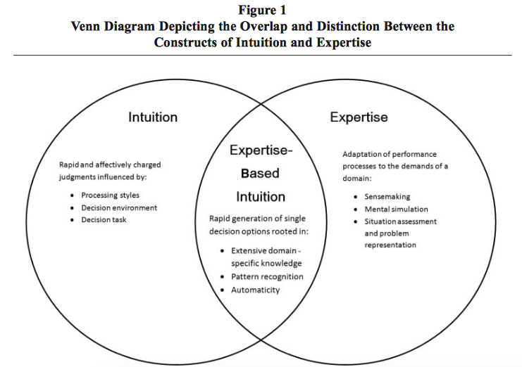
The authors of this review examined literature on intuition, expertise, and how expertise-based intuition plays a role for decision makers in organizations. According to the authors “Expertise is at the root of effective intuitive decision making in complex organizational settings, and therefore understanding how to develop and manage effective intuition in organizations is, in part, linked to an understanding of human expertise.”  Expertise-based intuition is different because it draws on domain-specific knowledge to answer questions. Expertise and intuition are not synonymous.


However, a person cannot rely on intuition alone. Overlaying on intuition can also be a source of error. Instead, an organization should set performance and developmental mechanisms for expertise-based intuition.  The literature points to several conditions where intuition is more likely to be accurate: characteristics of the decision makers, the decision task, and the decision environment. A person’s intuition is rooted unconsciously, which provides them with a quick judgment on complex patterns of relationships. Although, if the decision maker is taken out of his/her expertise, then the likelihood of his/her intuition decreases.


Since intuition is based from expertise, experts possess both the experience and knowledge to take advantage of the intuition process. Using expertise and naturalistic decision making (NDM) helps decision makers explain the role of intuition in the decision making process. NDM is a type of decision making research that aims to understand “the way people use their experience to make decisions in field settings.” Tables 2 and 3 provide a summary of the mechanisms of performance and the mechanisms of development.


Critique:
While the authors adequately explained why intuition plays a large role in organizations and how to improve intuitive expertise-based decision making, they only laid out the existing knowledge based on management science. Looking at intuition from a different field, such as organizational leadership or intelligence, could cause different results. In addition, the authors did not touch on the level of expertise needed to be considered an expert, what situations would call for intuitive decision-making, and how people react to the intuitive expertise-based decisions.

Source:

Salas, E., Rosen, M. A., & DiazGranados, D. (2010). Expertise-Based Intuition and Decision Making in Organizations. Journal of Management36(4), 941–973. doi:10.1177/0149206309350084